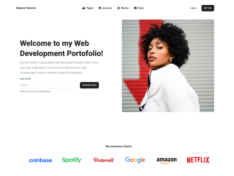
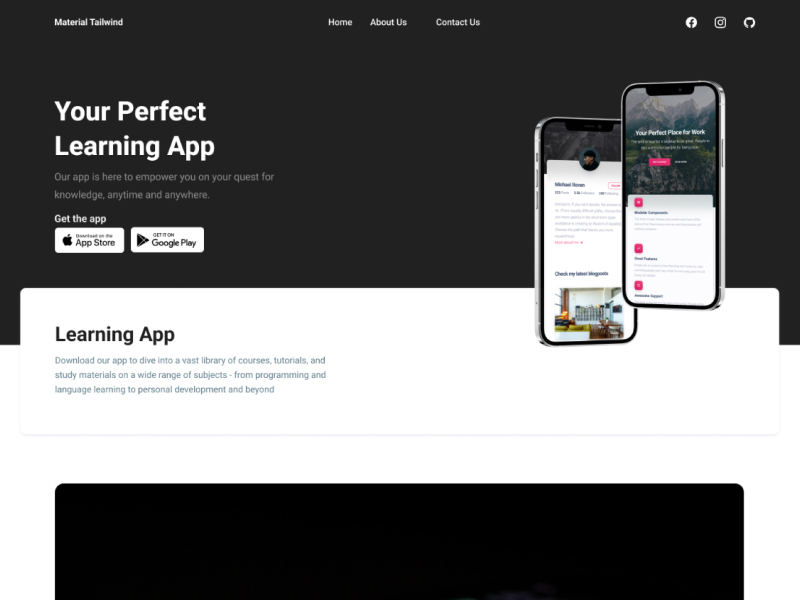
Cards are a versatile UI element that can be used to display a variety of content, from images and text to links and buttons, and can be grouped, stacked, or embedded to create a more complex user interface.
Foundations
Dive into the foundational principles and concepts that underpin our design system. Master the core elements before moving on to more complex components and blocks.
Related components:
Explore a diverse range of customizable components, each designed to enhance your UI/UX projects. From buttons to cards and beyond, these building blocks will help you create interfaces.
Ready-to-use Blocks
Discover pre-designed blocks that simplify your design process. These ready-made blocks can be seamlessly integrated into your projects, saving you time and effort.
Hero
15 Blocks
Features
15 Blocks
Banners
5 Blocks
Blog Posts
15 Blocks
Newsletter
10 Blocks
Onboarding
4 Blocks
Pricing
10 Blocks
Popups
5 Blocks
Teams
15 Blocks
Stats
7 Blocks
Testimonials
15 Blocks
FAQs
5 Blocks
Contact Us
13 Blocks
Content
15 Blocks
Logos
5 Blocks
Footers
10 Blocks
Ecommerce
8 Blocks
Authentication
3 Blocks
Maintenance
6 Blocks
Widgets
7 Blocks
Charts
6 Blocks
Tables
8 Blocks
Example Pages:
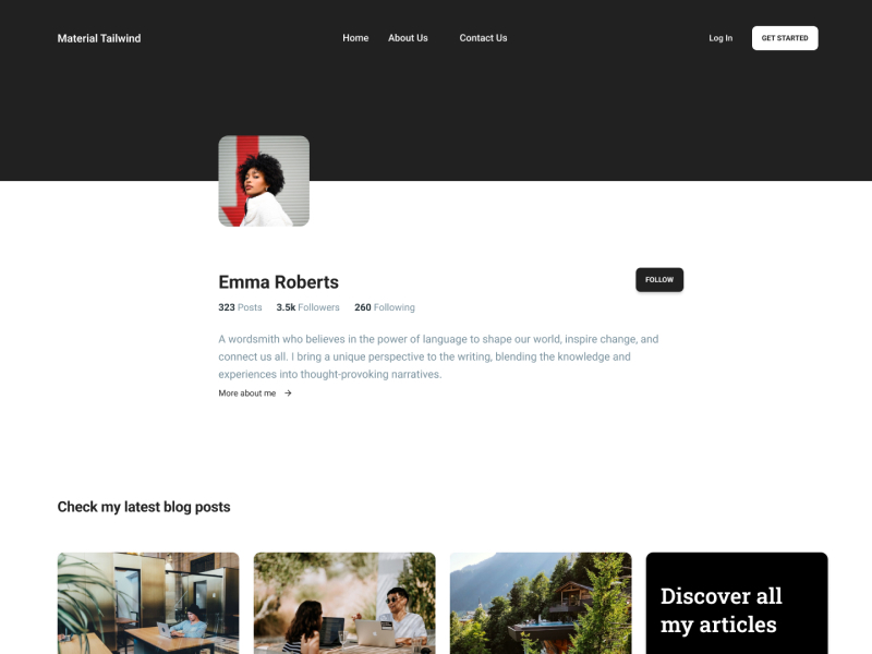
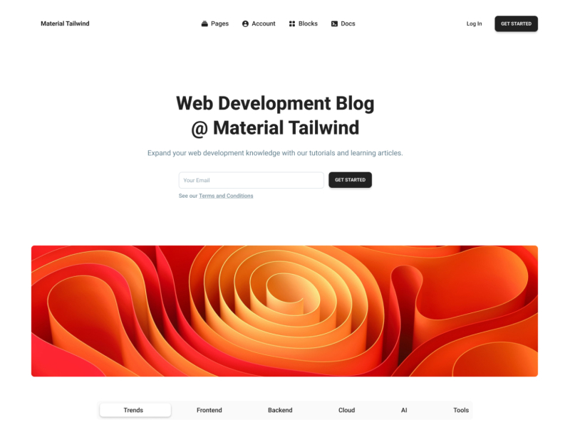
Explore fully-realized example pages that showcase the potential of Material Tailwind. Get inspired and see how to create complete, stunning web pages with ease.
